
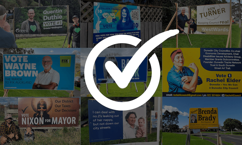

Local election hoardings are everywhere. But what makes a good one? Toby Morris judges this year’s corflute candidates.
Face, name, tick, face, name, tick. Yes, it’s that time again, the glorious period where hopeful would-be administrators line the streets with their appeals, beseeching us to tick the box next to their names with their hopeful eyes and non-confrontational sans-serif fonts.
If you’re wanting a serious look at the policies of the various candidates, I recommend the excellent Policy.nz website. But today we’re not looking at policies or track records, just a few dozen hoardings and what we can learn from them.
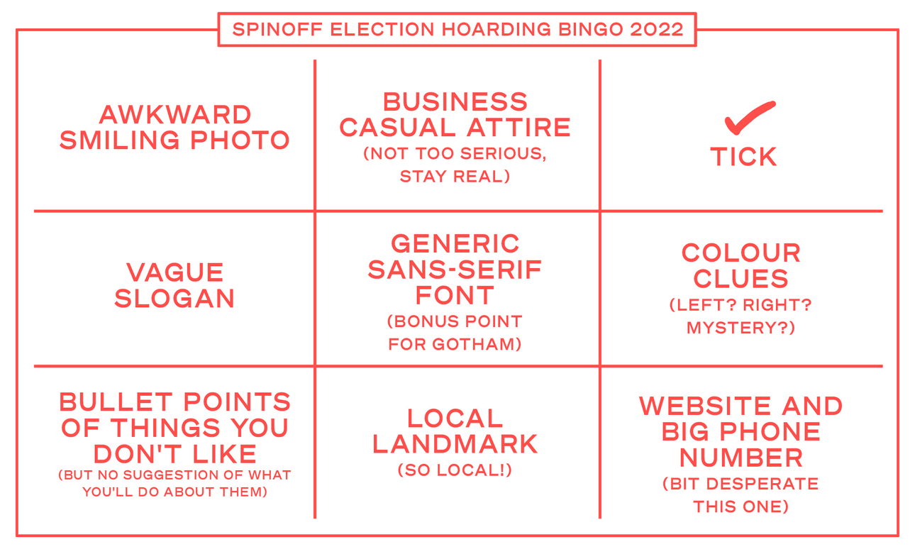
This year, overall, everything feels very templated – minor variations on a pretty set formula, with some colour clues (perhaps red, blue or green) to either signal your general political direction, if it’s something you want people to know, or some misdirection (orange, purple teal perhaps) if it’s something you’d rather they didn’t. I made this bingo sheet thinking it’d be a fun game, but it’s actually too easy. If you’re running in future elections, feel free to use this as a recipe instead. Pick five of these if you want to keep it classy, six and you’re good; seven is acceptable but starting to look a bit busy.
But if everyone is following the same recipe, won’t all the hoardings look exactly the same? Well, yes and no, but that’s what makes it interesting. With constraints so narrow, any little deviation from it becomes highlighted, for better or worse. There are people who excel within the limitations and execute the task perfectly. Then there are people who buck against convention, and this can go two ways – they either innovate and make something new and interesting, or they demonstrate they didn’t understand the job at hand.
It’s easy enough to be adequate, tricky to stand out as excellent, and harder still to be original and new. And how do I put this nicely: at the weaker end of the design spectrum the people who can’t restrain themselves from getting weird tend to make themselves obvious. Shit floats.
If we’re being honest, doesn’t that sound a little bit like what we’re looking for in our local political candidates too? For community boards and councils, being capable, organised and clear-headed sounds good. Maybe for the mayor we’re looking for someone who excels or stands out, but ultimately we really just want to make sure, at the very least, we don’t accidentally vote for someone who’d be totally incapable of keeping up with reality.
What I’m getting at is that design can give us major clues about competency and character. Not every time – I’m sure there are terrible candidates with nice designs and great candidates with shockers – but it’s something to consider.
All that said, let’s jump into it, roughly moving north to south. Thank you to everyone who sent in photos. If your area isn’t represented here, send me some pics next time.
Auckland
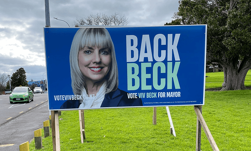
The general standard among the main players for the Auckland mayoralty this time around has been pretty solid. This is a slick and appealing piece of work for Viv Beck, with an uncluttered layout, a clever and simple slogan and clean typography. The blue and pale green colour scheme gives you a clue to the political angle she’s aiming for, and the combo works – it’s bold and eye-catching. She’s had some major issues with funding her campaign, and bounced around agencies with varying results recently, but the campaign actually got off to a good start with these.
Nice typography here – the typeface is Gotham or something extremely similar (the M looks different), which has become the default font of election campaigns around the world ever since Obama used it so effectively in 2008. The popularity of the style tells you a little about the current times I think. It’s crisp and modern but mostly neutral. Friendly but not too casual. Safe. I like what they’ve done with it here though, the slant makes it feel lively and personalised and the boxes give some structure.
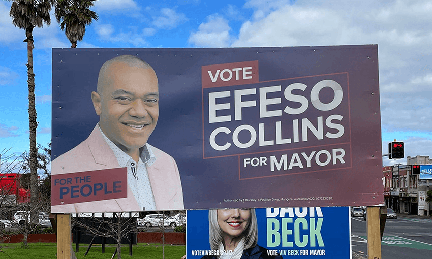
The colour scheme again is telling. The blue to red gradient is a clear “mayor for everyone” truce play, but overall it ends up feeling slightly lacking in contrast as a combo. And it might be a printing problem rather than a design one, but the photo of Collins ends up feeling ever so slightly washed out against such a murky mid-toned background.
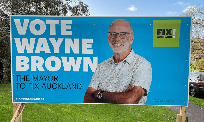
Contrast that with this blue that zaps your eyes from a block away. The big bold type is simple but effective too. Of all the hoardings I’ve reviewed this year I believe Wayne Brown is the only candidate to be wearing such a prominently displayed fancy watch. Ooo la la.
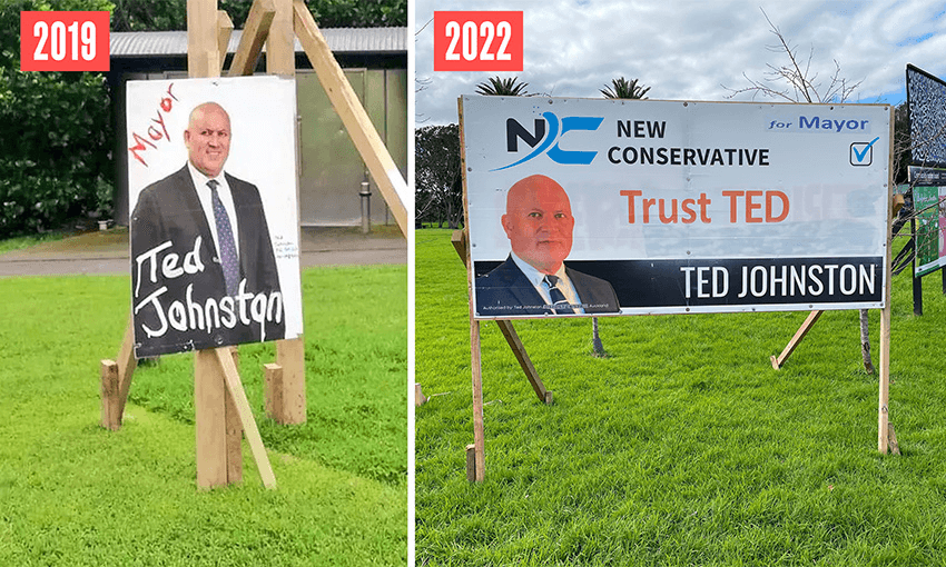
Look who’s back! In 2019, Ted Johnston teased Aucklanders with perhaps the most terrifying and threatening hoardings of all time: a grimacing face with hand-painted text, dripping like slasher movie blood. This time it seemed like he’d gone legit – sure, he’s just recycled his New Conservative party hoardings from the 2020 general election and chucked a sticker in the corner saying “for mayor”, but look at the difference it makes.
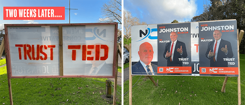
But he couldn’t leave them alone, could he? Within a couple of weeks, they looked like this. Ted, Ted, Ted, what are you doing? Absolutely cooked.
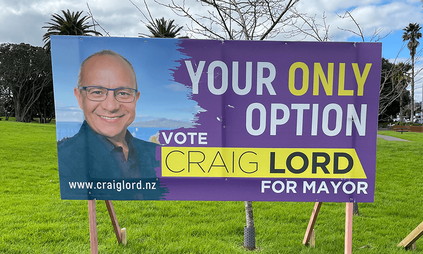
Speaking of self-sabotage, this is the worst election slogan I’ve ever seen. First, every single person walking past, seeing this alongside several other options, will scoff and say “No you’re not,” which is a pretty bad start, and secondly, even if you ignore that, it’s so negative and defeatist. How’s your new mayor, is he good? Not sure, he was the only option. Makes me sad for the places that actually do only have one candidate. The design is fine, but overall: sad.
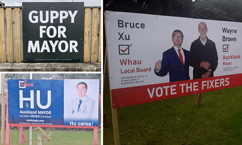
A couple of good slogans to cleanse the palate. Upper Hutt’s incumbent Wayne Guppy goes for the bold move of not putting his photo on, and instead hoping people mistakenly think Black Caps power hitter Martin Guptill has entered politics. “Hu Cares” is perhaps my favourite slogan of the year (and pulls off the classic V-in-Vote-as-a-tick combo).
Then I’m fascinated by this dual “fixers” effort, which I assume was Bruce’s idea rather than Wayne’s. Two clues why: first, the crappy reflections on their glasses and Wayne’s awkward pose suggests this photo was taken on a phone, quickly, and possibly without Wayne’s full knowledge. Second, it looks like the name “Wayne” is patched over to fix a typo, and Waynes don’t spell Wayne wrong.
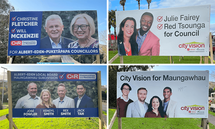
OK, on to some team ones. The approach on this seems to vary in different areas but in central Auckland, where the electorate MP job has swung between Labour, National and Greens in the last 20 years, local candidates usually avoid overt references to party affiliations. So we get this funny situation with the more National-adjacent C+R team and the red and green City Vision team with tiny little Labour and Green logos in the corner.
A notable development this year though: many C+R candidates, formerly suited, now seem to have taken their ties off. I like to imagine they’re a band, or the hosts of a new TV show. Do they look like a string quartet, or a mumbly shoe gaze band? Great ticks by the way.
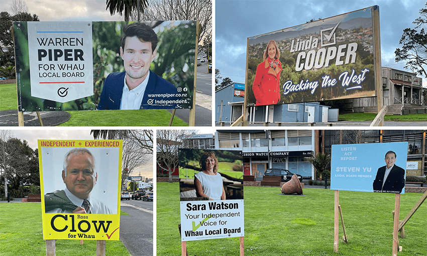
Moving out west, we see a ragtag band of independents with a mixed bag of design skills. Warren Piper’s is gold star quality, ticking all the boxes for a solid professional look and a great example of the trend of taking your photo against a natural background. Linda Cooper’s is bold – the font and drop shadow are kind of 90s, but I’m not mad at it. Ross Clow’s yellow is attention-grabbing and he’s gone for the unconventional portrait rather than landscape format, but a rare sighting of a serif typeface makes it feel rather staid and old fashioned. Love the “Clow for Whau” slogan though, even if it took me a minute to get that it rhymes. (Clow like glow, rather than plow.)
Sara Watson is very enthusiastic with the tick size, and Steven Yu’s polite white on baby blue text and “listen act report” slogan make it seem like he’s volunteering to nark to the teacher rather than run for office.
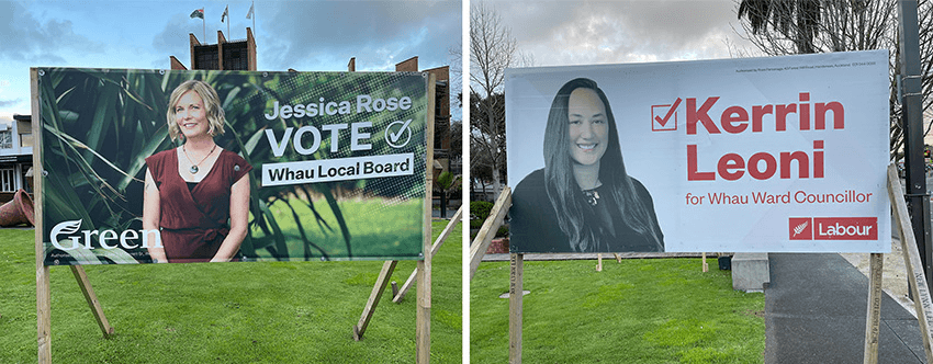
I’m putting these ones here to show the contrast with central Auckland. West Auckland is a traditional Labour stronghold, so it seems to be OK to fly left party colours more clearly out here. The Labour template is fairly generic but very clear and professional-looking, and I like the Greens template too. Again we see the angled type and nice photography against a natural background that gives some personality and a relaxed mood.
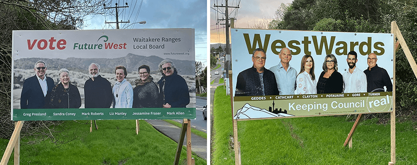
The west still has some teams: These two crews looks like they’re about to have a breakdance battle in the carpark behind the Henderson Countdown. Again we see the red/green clues on the Future West one, and another nice natural photo. This one ticks the natural landmark box too with the ranges in the background (and the wind). Meanwhile WestWards’ khaki is an original neutral colour scheme, and they’ve gone local landmark too with a drawing of the ranges in the bottom corner.
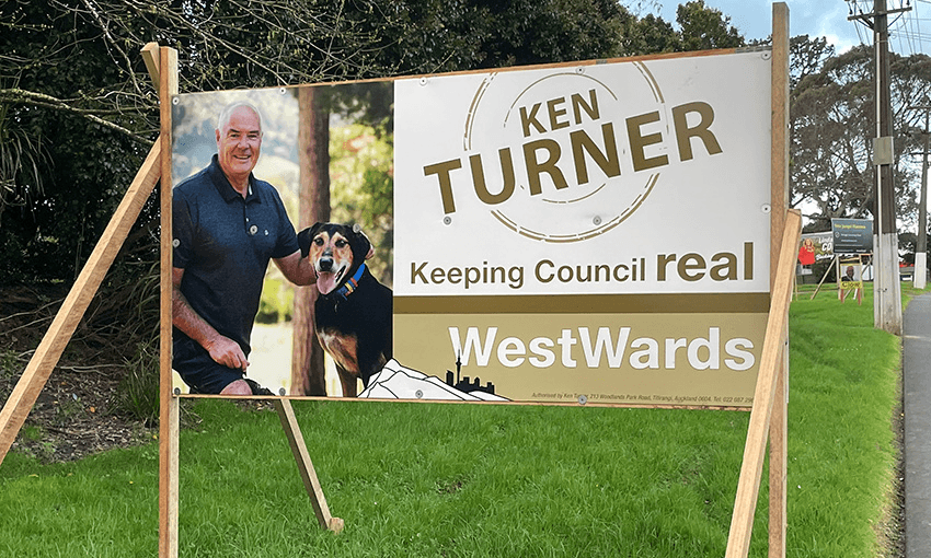
I’m a bit dubious about the sudden shouty font size change (REAL!), but I love this photo. Why not pose with your dog? It works for me – an easy shortcut to some warmth and character.
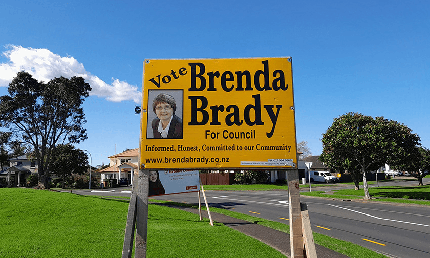
One last Auckland one. At first glance this looks old fashioned and slightly daggy, but the more I think about it the more I like it. The rare serif font, the mustard yellow and the small photo in the frame combine to deliver a slightly 70s vibe. It’s not “cool” but maybe council isn’t cool. This gives off “I’m ok with sitting though really dry and technical three-hour ordinance meetings”. Apparently Brady has used these exact same signs for at least three elections in a row, so I admire the pragmatism.
Hamilton
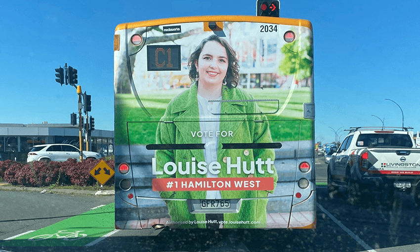
Moving down to Hamilton, these bus designs are great. The orange and apple green combo feels bright and positive and the layout is simple and uncluttered. It’s a design cliché but bears repeating: less is more. Cramming in too much unnecessary information means people walk away remembering nothing. Nice one.
Rotorua
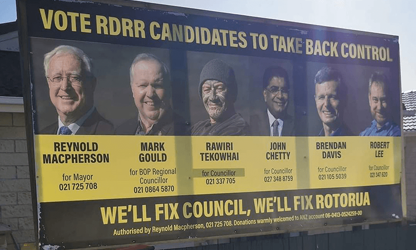
In contrast, look at this grim mess from Rotorua. Six faces, personal phone numbers (why?), an appeal for money and bank account details which gives off grifter vibes, and not one but two slogans that both manage to come across as menacing and aggressive. In short, I got a negative impression from this. Interested to check up on my hunch, I googled Mr MacPherson and quickly found headlines like this. I see.
Taranaki
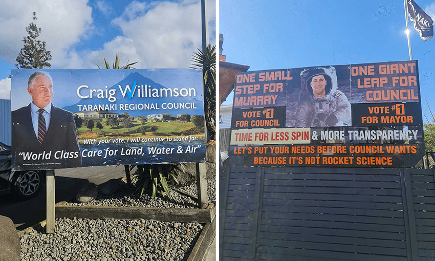
Two contrasting approaches from New Plymouth. Craig Williamson goes in strong on the local landmarks with a big Mt Taranaki landscape, contrasted with the formal suit. The tick integrated into the W is pretty snazzy, but overall this is a touch too busy.
Murray (no last name?) on the other hand has taken the full wild-card chaos option. I mean, it’s bonkers but I enjoyed it, particularly the suggestion that being the mayor won’t be a huge challenge for Murray, but Murray being the mayor will be a huge challenge for the council.
Hawke’s Bay
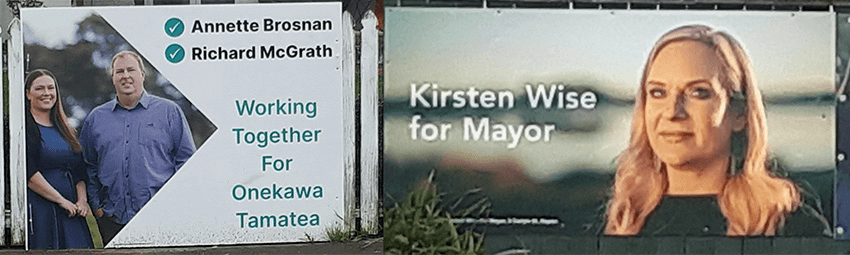
Two quick ones from Napier. Andrew who sent me these suggested the one on the left looks like parents who aren’t mad, just disappointed, and I think that’s bang on. Meanwhile, last time I wrote one of these articles I said Kirsten Wise’s 2019 hoarding looked more like an ad for a new Netflix crime drama than a hoarding – but she won, so maybe that was a good thing. This one is simple and has a really nice photo (again, the natural landscape background trend!) so I guess the show might be getting a second season.
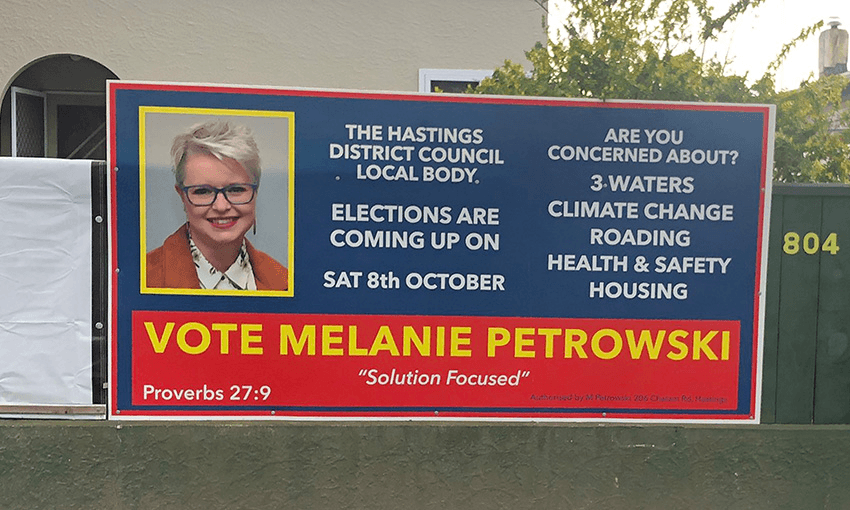
Here’s one that gives off a clear “no idea what I’m doing” energy. The columns are hard to read, there’s more space devoted to explaining the date of the election than there is given to the photo, and there’s a classic list of vague complaints with no suggestion what she’d do about them. Proverbs 27:9 is about perfumes and friendship. Okaaaay (backing away slowly).
Flaxmere
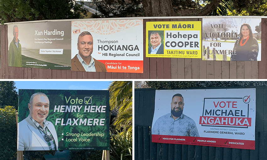
Next we have a really solid set from Flaxmere. Victoria’s black text is a bit hard to read from a distance against that background, but apart from that, all of these are clear and effective. The Hokianga, Heke and Ngahuka ones are particularly good: easy to read, tell you something but not too much and have just the right amount of personality. And some great ticks. This is how you do it.
Masterton
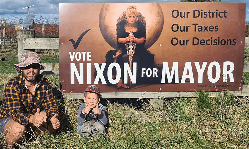
From doing it by the book perfectly to thinking outside the box, we move down to Masterton and find Tina Nixon. Last election she had a chainsaw and a line about slashing rates. This time she wants to rule the Wairarapa with a Game of Thrones-inspired iron sword. Why not? It certainly stands out and tells you something about her approach too. The image rules but I just wish you could see the big dog better, would’ve really capped it off.
Kāpiti
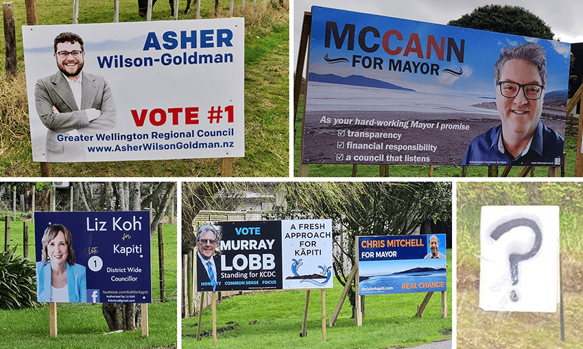
Moving down the line to Kāpiti, where everyone is crazy about their local landmark: four out of five hoardings here feature a picture of Kāpiti island. These are a bit all over the place to be honest: Wilson-Goldman’s is tidy enough but the others are all a bit crammed and messy. I like the “can” in McCann but I take exception to one of his three promises being something that other people will do – how can he promise that council will listen? And I have no idea what’s going on with the watery elements around Lobb’s island. Are they geysers? Dolphins?
I like the question mark one though, which does have a small “authorised by” message on it, so it is election-related. Great to see some representation for all the people who have no idea what is going on.
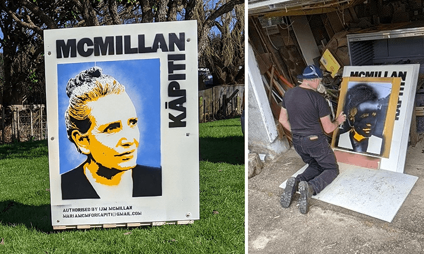
Here’s another great thinking-outside-the-box idea: these are stencilled onto the back of old recycled real estate signs by artist Joe Buchanan. I love this. It’s a very smart way to get around the immense cost of printing these things and the environmental damage they cause. Most importantly for this review though, they also look striking and memorable. Lovely work.
Wellington
I don’t know who this guy is, but he makes an original hoarding at least. This is almost good, but somehow manages to end up being really weird. You can see how the thinking probably started off in an interesting place, and the typography and layout is slick, but along the way it’s gotten tangled up in its own cleverness, tripped over and landed on its face.
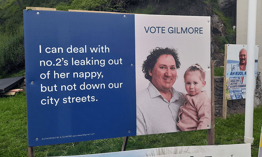
The image with the kid is an interesting approach in theory – express some intimacy and show you’re a family guy – but here it somehow manages to end up feeling forced. The line nearly works too – a chatty light tone, acknowledge an issue – only it actually doesn’t make sense (so, he’s saying he wouldn’t be able to deal with sewage issues?) and just isn’t funny enough to justify devoting your whole hoarding to poo chat. A swing and a miss.
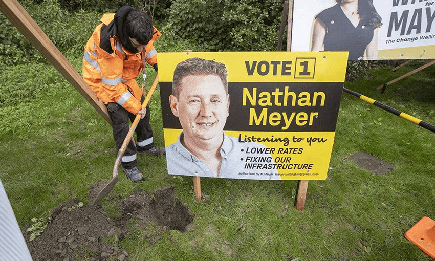
This guy has had an absolute nightmare too. His two policies on the sign are “lowering rates” and “fixing our infrastructure” (which are arguably mutually exclusive), but when he installed this one he managed to chop through an internet cable, cutting off internet for surrounding homes and… breaking our infrastructure.
(Something to note here: in Wellington it seems popular to both disguise your politics and do a kind of local reference at the same time by using a black and yellow scheme. Go Wellington!)
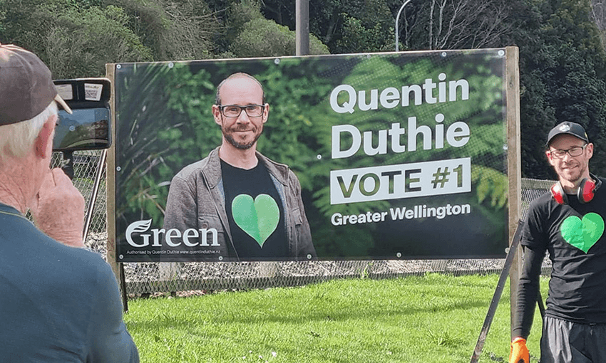
I can’t leave Wellington only showing two shockers. Here’s another solid Greens one, again using the angled type, simple layout and nice natural photography. Good photos go such a long way – this feels relaxed and comfortable, not trying too hard and no suit in sight.
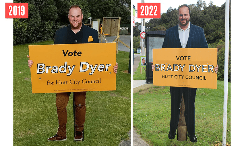
One more from Wellington, a visit from an old friend. In 2019 Brady Dyer literally went out of the box, transcending from a face on a hoarding to a full size body holding a hoarding, catching eyes and terrifying late night drivers. I’m so stoked he’s back again and up to his old tricks. Nice new blazer, Brady.
Canterbury
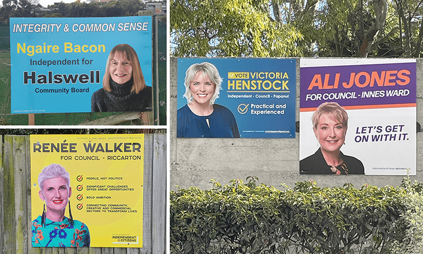
OK, moving down south we have this array of colourful independents in Christchurch. I’m always a bit suspicious of anyone claiming to represent common sense, and the yellow name on bright blue gets a bit lost. You read “Halswell” first which is not the first thing you need to know. Otherwise these ones all work OK – the yellow background and the purple and orange are the colours that most catch my eye. Walker’s probably has a little too much text on it but is still striking.
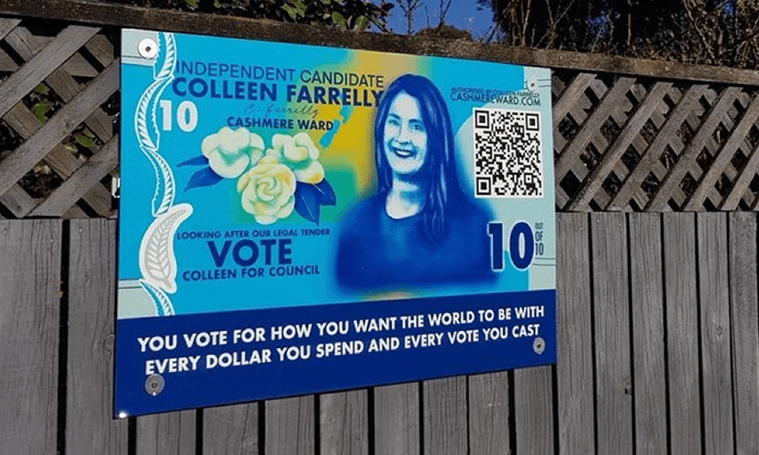
Oh boy. What on earth is this from the Voices For Freedom-affiliated Colleen Farrelly? At a glance this looks like a poster for a school production or a fundraising raffle. Honestly, the gall of comparing yourself to Kate Sheppard might be admirable in certain contexts, but here it feels obnoxious and clumsy. The faux-wise quote along the bottom reads like someone who has recently learned about the concept of democracy on Instagram. The sentiment about political influence through consumer spending is a vague truism but has no relevance to a council election, and once you remove that part, all that quote at the bottom says is “You vote for how you want the world to be… with every vote you cast”. Wow! Thanks for that! Strong “alternate reality” red flags here.
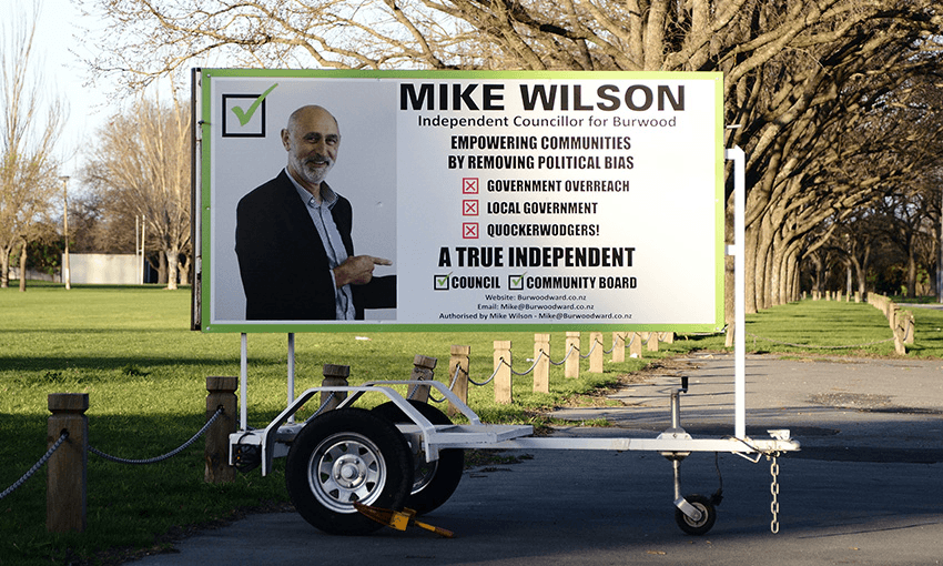
This guy almost manages to come across as reasonable enough but the mask slips with the bonkers line about “quockerwodgers”. I googled it so you don’t have to: it’s an old word for a wooden puppet toy controlled by strings. Get it?! Not this guy though, he’s a true independent (also VFF-affiliated). A controversial idea, but perhaps it’s not the best idea to vote for anyone campaigning against local government while seeking a position in local government. Destructive, self-important, delusional nonsense. Also his hoarding is too crowded.
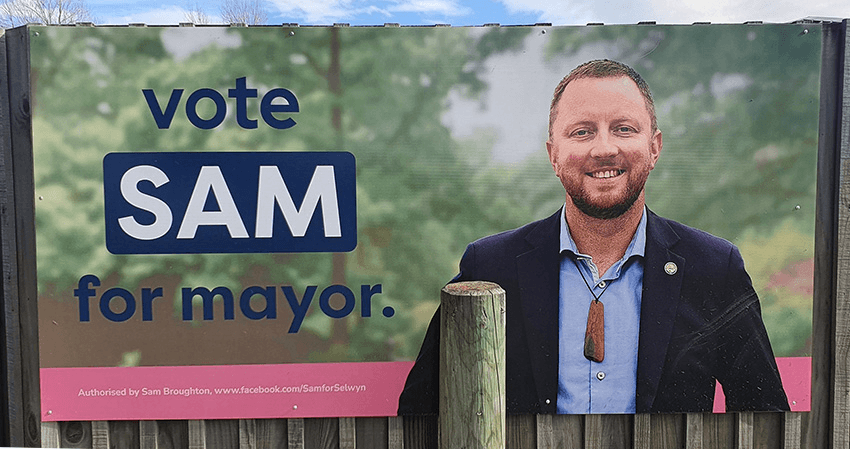
Anyway, here’s a nice one. In fact, I really like this one for the incumbent mayor of Selwyn. It’s a pretty confident move to put your first name only, and be relaxed enough that you don’t even capitalise the start of your sentence, but Sam pulls it off. The photo is good, and I like the navy and pink combo.
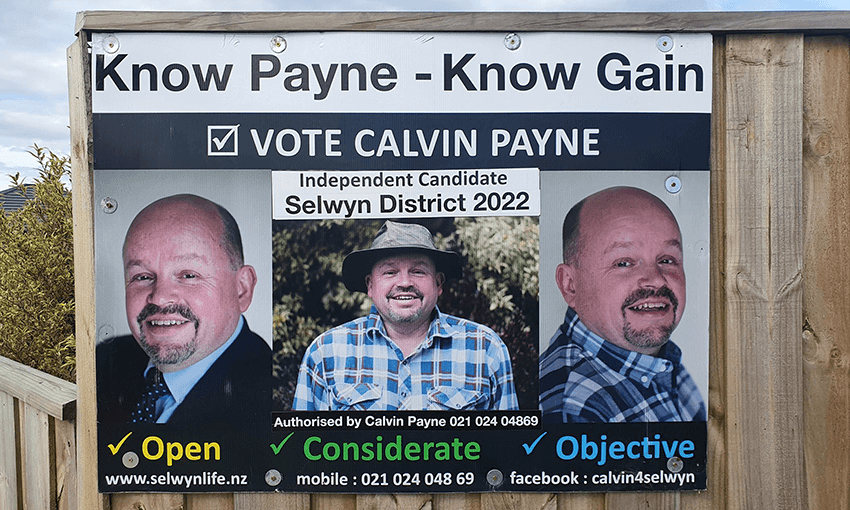
I also like this one, for different reasons. Sure, it’s kind of a shambles, but it’s a loveable shambles. Apparently he’s also been reusing these signs for multiple elections now, just updating the sticker in the middle. And good on him, it’s a winner. The pun slogan is great and the three photos to go with his three good features is fantastic. Open? Yep. Considerate? Yes, with a hat on. Objective? I know just the guy…
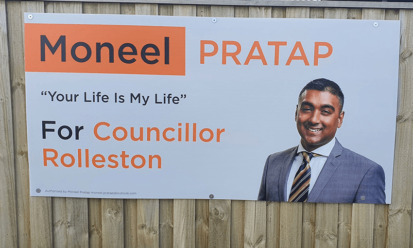
This one ticks all the boxes but somehow reads as “real estate agent”. Is it the suit? The head tilt and smile? Something about the layout? I like his quote/slogan though – I’ve always time for a slightly cryptic slogans that sounds like a song lyric.
Dunedin
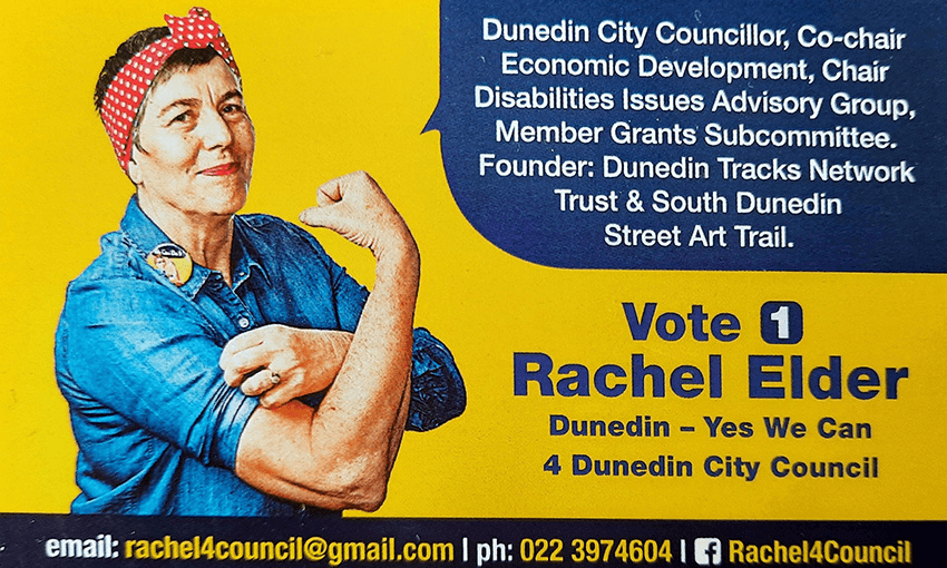
Alright, home stretch. I wish I’d been sent more photos from down south, I’m sure there must be more gold down there. I like this one. Very rare to see any humour used but this is fun. Probably doesn’t need the whole CV in the top corner, but it’s a pretty impressive list so maybe it’s fine.
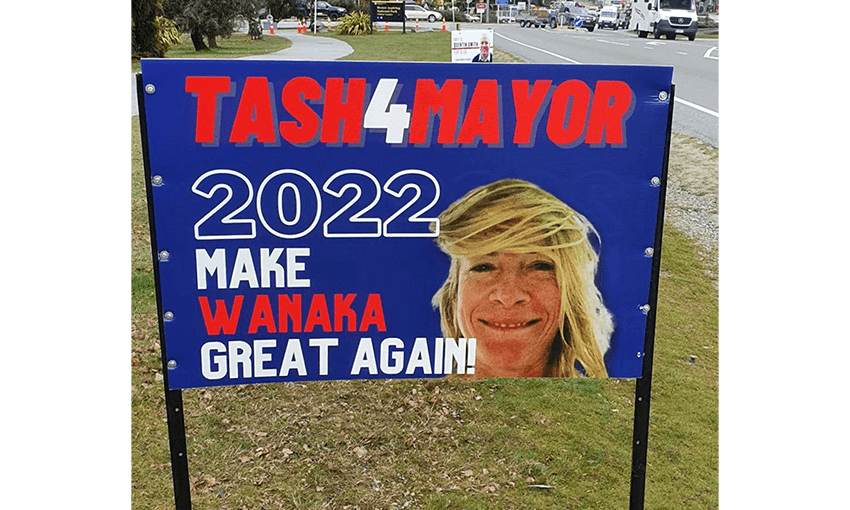
My friend Don sent me this one, and I can’t tell if it’s serious or not. Is this a genuine but cheeky campaign from a disruptive MAGA-loving Trump fan? Or is this a prank played on Tash by her mates? Would be a pretty classic joke for a hen’s night crew to pull off.
Invercargill
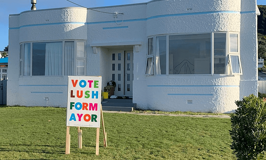
And last but certainly not least we have this cute wee gem from Marcus Lush in Invercargill. He’s taken the bold “no photo” route, but I guess people know who he is. The way the FORM / AYOR breaks is a little clunky, but it’s sweet enough that you forgive it. Overall it feels a bit like the front of a birthday card, but why not? Why can’t local body politics feel like a birthday party?
Follow our politics podcast Gone By Lunchtime on Apple Podcasts, Spotify or your favourite podcast provider.